

Find out the meaning behind our new look
Hi, and welcome!
Firstly, we would like to say a massive thanks for stopping by, we’re excited to update you!
We have spent a considerable amount of time choosing and creating the look and feel for Cyber Scotland Connect (CSC). The Cyber/InfoSec community in Scotland is one to be marvelled at, so something to emulate and represent it has been no mean feat to create.
Let’s start with the colour scheme
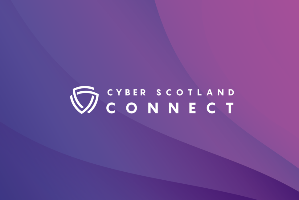
We wanted something different. Something warm and inviting for community members to feel proud to be a part of. As such, the chosen colour scheme uses vibrant shades of purple and pink, these warm colours also work to subliminally communicate our Scottish heritage.
Why the shield?
We thought long and hard about this. We aim to be accessible and champion simplicity. The shield can be viewed as an icon of strength, which is further underpinned by its common use in Cyber and InfoSex circles as being a symbol for ‘safety’. This is directly relevant to us, and what we’re trying to create, whilst at our core we are a community driven hub, this symbol highlights the safe and welcoming values that we want community members to feel and embody when attending events, and sharing their thoughts and ideas online.
The shield is fragmented into three stand-alone pieces;
One of our core values is inclusion, so we decided to put a spin on the original shield concept by fragmenting it. But, why? We felt it important to visualise the unification of different sectors, communities and other segments to create strength as a community, which is also why each fragment is a different colour. ️
Subsequently, these pieces align with the three core building blocks that are the unspoken three pillars at the heart of our proposition; our digital presence, our Scottish engineering heritage – for which Scotland is globally renowned, and connecting with people in the community (online or in person).
Last but certainly not least, the logo icon can be abstractly viewed as two shields inter-linking. This helps to visually communicate where CSC originated, through the merger of two InfoSec meet-ups, paying homage to the co-leaders of the community as it grows and flourishes.
We hope you’ve enjoyed learning a little more about the meaning behind our new look and feel!
Thanks for reading! We’d love to hear your thoughts and feedback.